State School Report Cards Offer Timelier Data But Still Have Room to Improve
- By Dian Schaffhauser
- 01/02/18
While a few states do a good job of creating "report cards" that help people understand school performance, most states "still need improvements to be accessible, meaningful and useful to audiences outside of education policy." That's the assessment given by the Data Quality Campaign after a months-long review.
DQC has been conducting a review of school report cards since 2016. This year, beginning in September, a DQC team reviewed school report cards for all 50 states as well as the District of Columbia, using categories such as ease of access, format, data elements and subgroups. These reflect both federal requirements and additional information that the organization considers valuable to families and school communities. For the evaluation process, the reviewers also contacted each state to obtain a link to their school report cards. For each state one reviewer looked at an elementary school report card while another examined a high school report card.
Among the positives identified from the review, the student test results being shared are getting more current; the DQC found that 48 states and the District of Columbia reported student test results no older than the 2015-2016 school year; among them, 18 states are reporting 2016-2017 school year data.
Also, many states are also going beyond what's required by federal or state law to include additional information on the report cards that families and others will find useful. For example, 43 states reference school climate, chronic absenteeism and parent or student survey results; 28 states report a metric on student growth over time; and 22 states are including postsecondary enrollment to show how students are doing after high school.
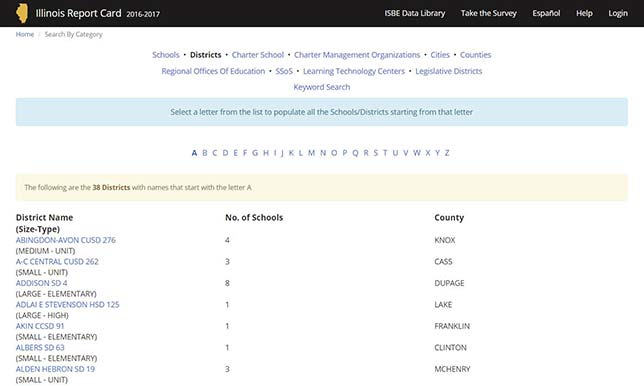
However, there's still plenty of room for improvement, according to the DQC. A biggie is that information is "hard to find." If, for instance, a parent searches for a state report card site, it's hard to figure out which link is truly relevant; once the home page for the report card is located, users need to "decipher" where to go from there; and the data tends to be spread across multiple pages (vs. different tabs on the same page).
The information is also hard to understand in many cases. Directions for how to interpret the report is "written on a postsecondary reading level," the DQC observed, "making reading this test challenging for the average consumer." Acronyms proliferate. And a majority of states either don't disaggregate student performance by subgroups and/or don't translate text into other languages.
A brief report on DQC's findings offered four areas where states could quickly improve their report cards:
- Simplifying the language to make it readable by everybody;
- Minimizing the use of acronyms and explaining terms that aren't commonly understood by parents;
- Breaking out data about student performance by subgroups to help identify gaps and to do so in languages other than just English; and
- Using the report cards to communicate what the state's priorities are to families and other interested people.
A five-page summary, "Show Me the Data 2017," is available on the DQC website. Additional resources, including the entire data file, are also available on the report card website.
About the Author
Dian Schaffhauser is a former senior contributing editor for 1105 Media's education publications THE Journal, Campus Technology and Spaces4Learning.