3 Tips To Caffeinate Teacher and Student Presentations
An award-winning teacher and author shares her secrets for transforming slide shows into interactive learning experiences.
In a seminar I attended, media analyst Tad Simons once estimated that 30 million PowerPoint presentations are given every day. Multiply
that by an average of 30 people in each presentation, and you are looking at 90 million people a day who are at best in a daze — at worst
dying from boredom.
On the education stage, the classic example of the talking-head syndrome is actor Ben Stein as the dorky high school economics teacher in
the movie Ferris Bueller's Day Off. (Watch the clip one more
hilarious time on YouTube: "Anyone, anyone….")
A big part of the problem for teachers and presenters in general is that there is a limit to the time humans can just "sit and get" (what
deluded teachers have been calling for years "listen and learn"). In his multimedia book Brain Rules, cognitive psychologist and
University of Washington professor John Medina records this time limit as 10 minutes.
Yup. Even when listening to someone as entertaining as John Medina, students start tuning out like clockwork as lectures approach the
10-minute mark. Schools are beginning to take this timing to heart, with teachers stopping to give students the opportunity to pair share,
answer questions, discuss what they just learned or project what's coming next. At
Grimmer Elementary School in Fremont, CA, after each 10-minute chunk of teacher-driven content, students have two minutes
of discussion with a partner. The school calls this "10:2" and teachers observe the practice almost religiously.
Video Breaks
Breaks might be used to show illustrative videos. For example, when discussing
career options, it might be fun to see how talents manifest at a young age, as in the charming YouTube video of a precocious
"Casanova."
Teachers and older students alike can be swept away by the passion of violinist Drew
Tretick playing Time to Say Goodbye. As I wrote to Drew, not only has he given the world
exquisitely beautiful music, but he has also inspired many listeners to "find their own violin."
Access to videos was the reason I moved from PowerPoint to Keynote because of Apple's choice to embed videos in Keynote slideshows. I use
at least 4 to 5 video clips in an hourlong presentation and love the security of knowing I can plug my Keynote (backed up onto a flash drive)
into any Mac's USB port and all the video clips will play flawlessly. Of course, the fact that Keynote will open existing PowerPoints has made
the transition a lot easier!
Compare and Contrast
More subtle changes of pace flow out of small group discussion of juxtaposed images. In his
classic publication What Works in Schools, Robert Marzano has ranked "identifying similarities and differences" as the number 1 strategy for
effective teaching and learning. With that knowledge, armed with our LCD projectors and (if we're lucky) overlay writing devices, we can
display (and annotate) images side-by-side while small groups of students discuss those similarities and differences. You can access my
YouTube video "Teaching the Teacher To Use Visuals and Music" to see
groups observing the maple leaf and the daffodil shown below.

Or you can elicit laughter every time as you invite discussion regarding options for toilet paper orientation.
On a more serious note, teachers can increase interactivity by encouraging small group discussion of before-and-after slides. For easier
comparisons, make sure the images are juxtaposed on the same slide rather than stacked in sequential slides. Let the viewers discover the
changes rather than listening to the presenter lecture about them. Use your annotation tools to draw attention to specific points the
participants mention.
The Power of Pictures
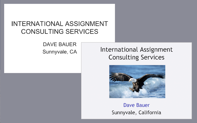
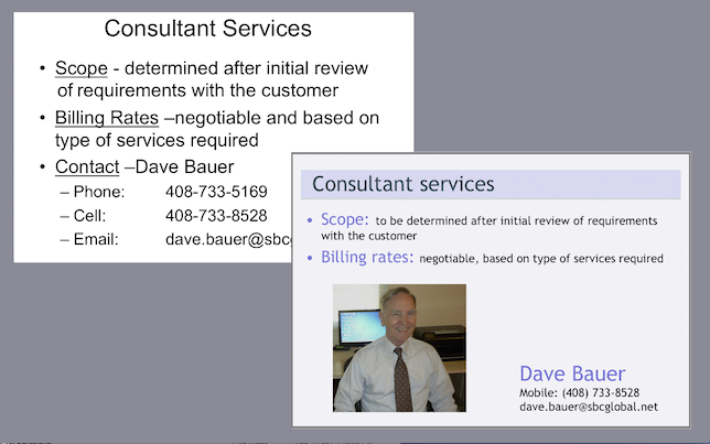
For example, by making a list of everything that changes in the résumé below, you will have
created your own critical list of editing points for text-laden slides:


- Using upper- vs. lower-case letters;
- Adding a background;
- Adding a picture;
- Color vs. black and white;
- Left justifying text;
- Leading, grouping and white space; and
- Removing superfluous and redundant text.
The eye will go to images before it goes to text, to color before black and white. So, think of your full-screen, full-color images as
magnets to draw viewers' attention.
In a way, an image puts viewers on the same page and lets them share a common experience. But I like to remind presenters that images also
elicit different prior knowledge and experience for each viewer. A fun activity to make this point experientially (rather than lecturing about
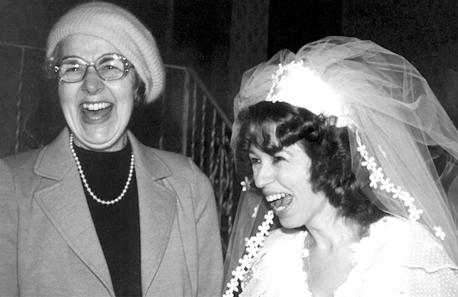
it) involves displaying the following full-screen, full-color image and then asking small groups to answer a series of questions:

1) Who are these women? 2) What is their relationship? 3) What is the event? 4) Why are they laughing?
You would be amazed at the range of stories that emerge! After several small groups tell their tales to the whole group, I tell them what
was actually occurring in the photo. (You have to come to one of my live sessions to find out, or e-mail me your story and I'll tell you mine.
You can reach me at [email protected].)
You can use your own photo and story for
this activity. Just make sure there are two people in the photo.
Other photos can serve to introduce topics in the curriculum, like this well-known poster:

Toward the end of a class period, project the image and then assign as homework to find out everything students can about it, including who
the woman was and what she represents in the image.
Free Resources
Dozens (maybe hundreds) more ideas to awaken the somnolent are explained in my latest book,
They Snooze, You
Lose: The Educator's Guide to Successful Presentations. The book also includes a DVD with full-color images (sized for your slide shows)
that are copyright-free for educational use. Publisher Jossey-Bass/Wiley has graciously offered a
free evaluation copy for educators
considering adopting the book for their courses.
You can also visit YouTube and search for "Lynell Burmark" to access related videos, and check out my Web site,
educatebetter.org, for articles and additional videos as well as descriptions of
presentations that I would be delighted to deliver at your conference or other educational venue.